Implementing a design process on a fast moving, feature focused product environment to help with design maturity (on an all remote team).
Background
The Risk Portfolio emerged as one of the fastest-growing SaaS offerings within PwC's Product & Technology Group. This rapid growth was driven by the post-pandemic landscape, where companies woke up to a heightened awareness of risk and regulatory issues. Recognizing this need, PwC's risk products directly addressed these challenges, leading to its remarkable success and rapid expansion within just six months.
My Role
Design Manager, minimum 50% of the time working with Product owners on new features, client requests, new business requirements, design work estimations, etc... scale of the work varying between low fidelity wireframes, Miro boards, user journey mapping, rapid prototypes for business and strategy discussions, to higher fidelity new feature designs. The rest of my time was about sharing the work with initially 2 Senior UX designers that became a team of 5 eventually, all sitting at a dedicated agile pod, focused on their own front-end team’s work. One of my objective was keeping all the design team informed about other designers’ work, so we had regular weekly team updates besides 1-1 conversations and office hours to gather with engineering, product and customer success teams. I was reporting to a Sr. Design Manager that was mostly working on administrative tasks and new-biz pitches, overseeing multiple product portfolios, which Risk and Regulatory Portfolio was one of them.

What did it look like, when I started.

Design Challenges
Risk Detect (which had its name changed a few times for a better alignment across other PwC offerings) faced its first challenge as it wasn't initially designed for end users, but rather targeted for internal use of consultants.
As we switched the business model from billing consultancy hours to selling seat licenses, the overall look and feel of the software became more important than ever to represent software product quality of PwC. Some UI inconsistencies that were overlooked and sacrificed to prioritize functionally impactful features. Now it was the time to fix those with implementing AppKit3 - the design system of PwC products.
"Time spent by users" (or it could also be interpreted as application performance), was another metric we were keeping an eye on. The quicker a page loads and less time spent for a case worker to do their day job is a win on experience design. Users spending as little time as possible in the application (unlike marketing/advertising KPIs) was a big advantage against the competition. “How to achieve that?” is both an engineering and user experience design question that we worked together to solve.
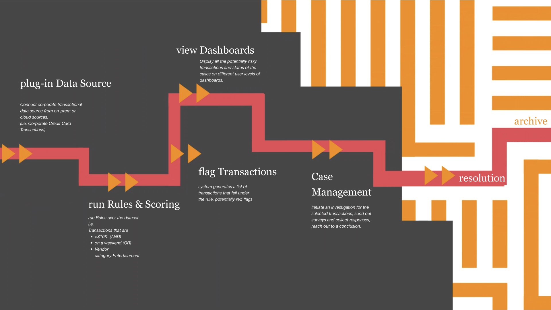
Risk detect product workflow and capabilities.
Business Model
Robust multi-tenant SaaS product with ability to configure features per client.
Who is using it and what does it do?
Business Sponsors, Compliance users, Executives, Third-party contacts
The core UX requirement was to fill all the missing pieces of the user-journey puzzle. It starts with the data input (let’s say corporate credit card transaction data of a global brand’s employees), running rules, scoring transactions based of their risk potential, and then displaying those in various levels of dashboards (from executive level to case manager).
One of the biggest value proposition was the Case Management module, which allows Corporate Governance workers (part of ESG) to initiate an investigation around those cases, working together on collecting materials (pdf documents, chat messages, various other files) and finally coming to a verdict and storing that entire journey for auditing.
Since we had an integrated case management module, we were basically competing with an entire ecosystem from salesforce to Microsoft Excel. The software architecture was initially designed to be very flexible, every feature was built as a feature flag, so it could have its use on a wide range of industries, from tech to pharma, to defense industry to insurance.
Building trust into the app
Our products were a reflection of the know-how of our consultants and the expertise of our partners (“We know what you need and how to solve your problems”). That was translated into the user flows, where we knew what a day in the life of a case worker, or data analyst (or even an executive) looks like. Bringing those custom interfaces, dashboards to help them make informed decisions. (that's what the risk management is all about)
The PwC Design System “AppKit” provided a variety of basic components, the nature of the work we were dealing with, that was heavy data tables, with millions of rows of data, required us to adopt some 3rd party libraries (basically AG-Grid), to make loading times much quicker. The same issue emerged with the limited visualization components of AppKit, where Risk detect was proud of their multiple customizable graphs and charts. So we decided to integrate with D3.js and Highcharts (with the CSS customizations for seamless look and feel).
Oops. "Are these charts coming from an external source? Because this font family doesn't belong to our product UI."
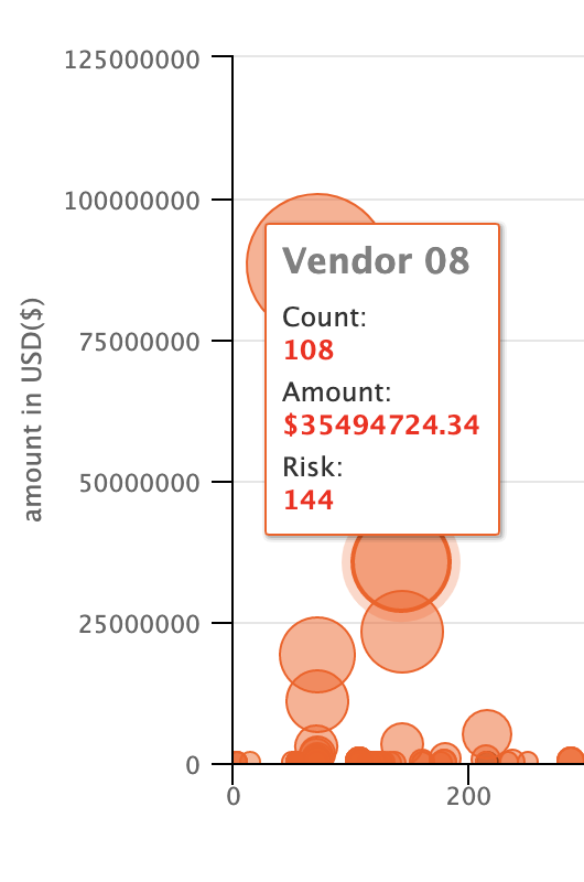
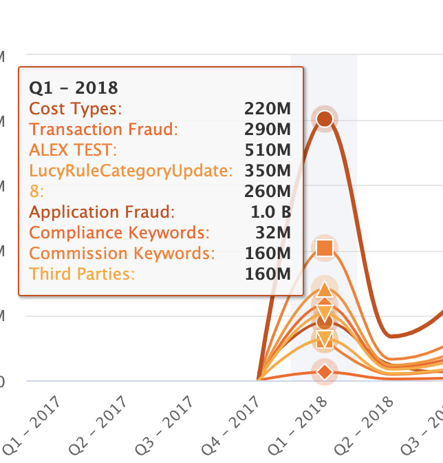

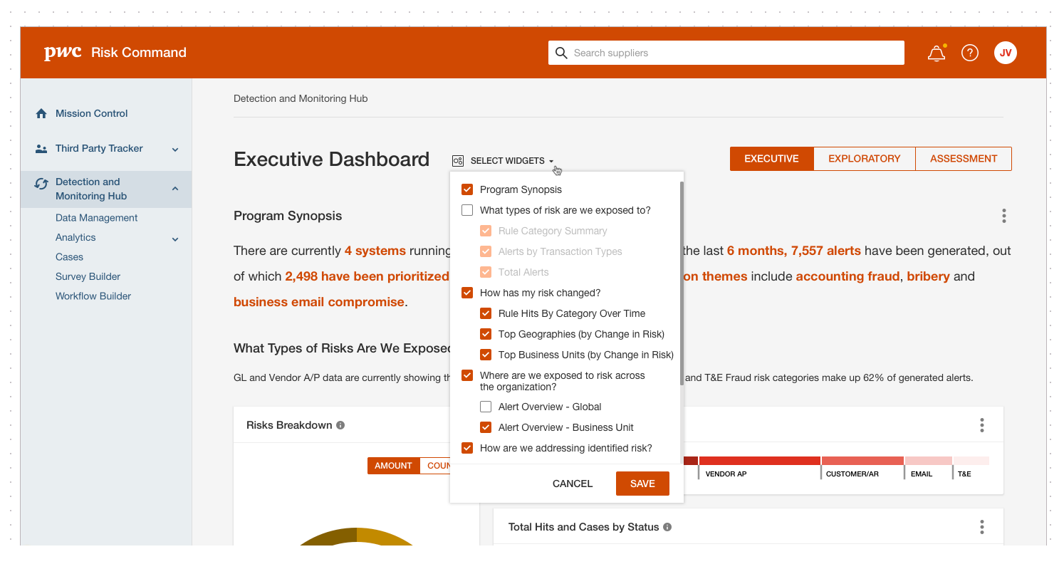
Dashboards curated for different user types: Executive, Exploratory, Case Results and Flex.

Previous state Case view, also displaying Rules and other metrics related with Data Analysts' domain. (Note to self: Make sure the primary button represents the most important action of the page, and use the button hierarchy accordingly.)
Implementation Strategy
Since Risk Detect had a very heavy feature improvement roadmap, and bringing in new customers depended on the product's capability list, we have decided to break down those UX/UI related updates over the course of a major release cycle (quarterly) and handle the smaller consistency related tickets every sprint with a dedicated design tag on our sprint management. That way, as a design manager, I could be able to distribute the workload more efficiently across the dedicated designers of the 2 Agile Pods, while being able to keep working on feature requests.
BxT TeamWork
The insights and information about how our clients work in different ways and what would be the best solution for us to satisfy all the use cases, came directly from Customer Success team, Business Partners and Managing Director. Design and Product teams work very closely to achieve the vision, to push the engineering team to utilize various technologies to efficiently ship the product as intended (using low code, embedding iframe, etc). QA team members reaching out to design team to confirm certain design intentions, or creating quick solutions for edge-cases on the go, documenting every interaction clearly under the comment section of the ticket (including sharing screen recordings and explanations over the prototype), enabled a healthy product development environment, without getting affected by time zones.
BxT represents Business, Experience and Technology, a PwC Agile Framework, allowing High performing agile organizations, reimagining customer journeys, achieving product excellence and creating solutions to add value for customers. (from Google Search)
#smallDetails
with big impact:

Preparing and sending surveys for the Case Investigation

I designed a portal for the users that are assigned a survey to complete (External Surveys). This interface is publicly available, so it requires to be accessible, easy to navigate and responsive (for mobile web).

Design peripherals, yet the first step of the product encounter. e-mail notifications that are sent to users to activate their account or respond to a survey. Direct, concise UX writing. #smallDetails
When you give users too much flexibility over the display components, then you need to think about what happens when they unselect all. #smallDetails

I have a lot of fun, thinking about empty states and how to convert them into a delightful moment with the help of UX copy, instead of a silent void space. #smallDetails
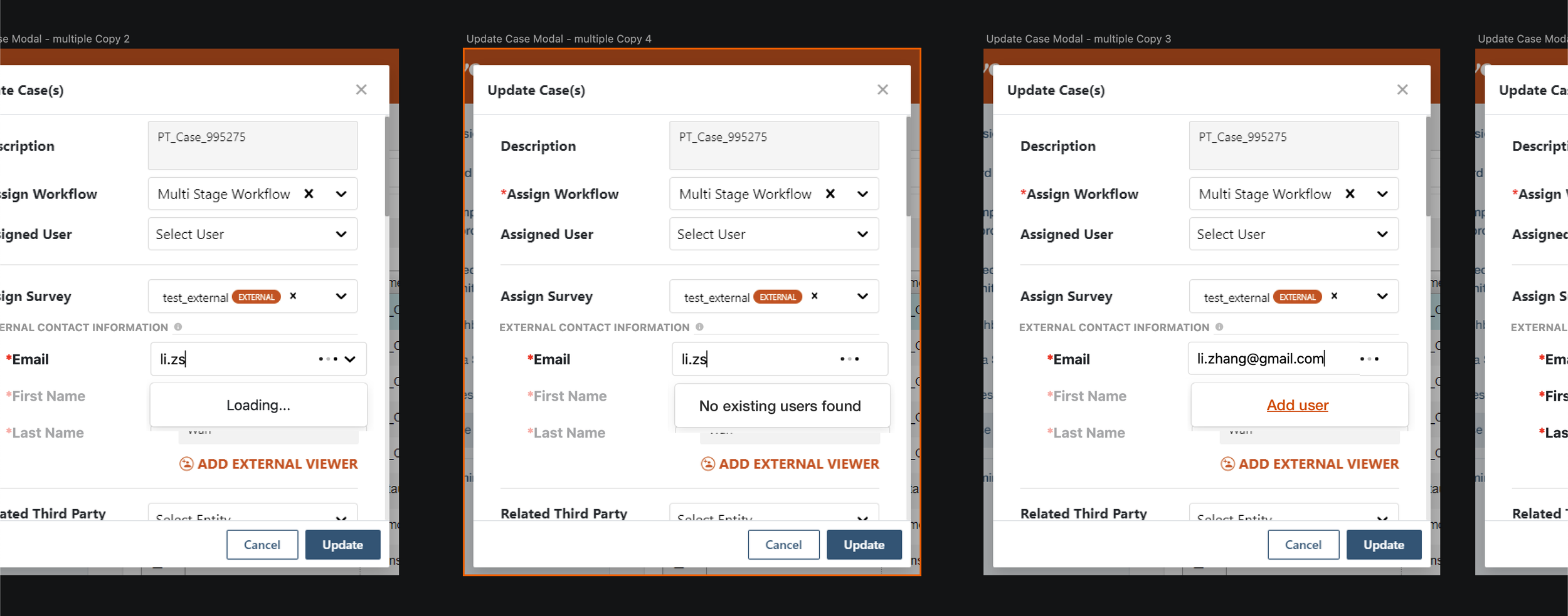
Saving time and clicks by utilizing type ahead feature on a search field. If the user already exists, you will see immediately. If not, then you can add them after entering their email. (The most common scenario for user search was copy and paste) This behavior was implemented across all the type-ahead search fields. #smallDetails
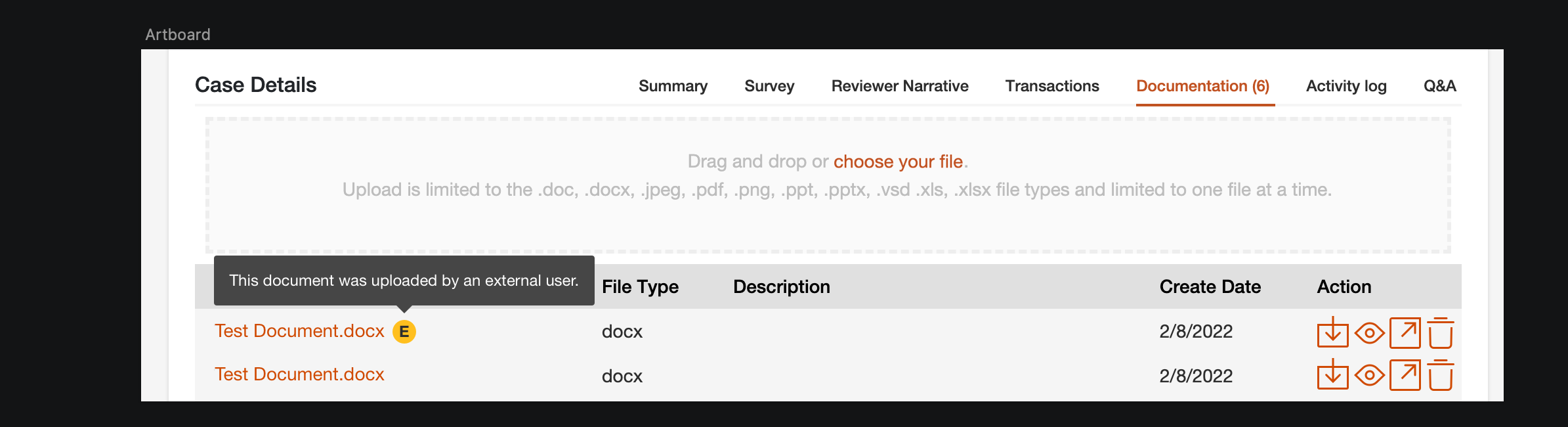
A small but eye catching tooltip to indicate this document is uploaded by an external user. So be diligent about potential risks. It is all about minimizing risks and making informed decisions. #smallDetails
Learnings (a.k.a. Notes to self)
While some of the learnings are organization specific, there are some designer soft skills I enjoyed improving on, during my time with Risk Portfolio.
File Structure. Developers often not required to have a knowledge of design tools, like Figma, and even it is pretty simple to navigate around; setting up a page structure for everyone to keep track of the latest iterations and final designs is a must.
Working with design system tokens, fixing CSS related issues and some bad development habits (like writing custom classes) keeps the entire development from visual design bugs. So it is helpful to have a design QA and understand the cause of the defect before those errors make their way to the code release.
Communication. There is no such thing as too clear, or too much communication, when it comes to explain all the intended design details, the reasoning and the system around error messages or info tooltips. Annotations are helpful to explain scenarios for QA.
Sprints. Since “it is not real until it is a story”, (on DevOps, Jira, tool of choice) being there as a designer goes a long way. I was tracking acceptance criteria for UX tickets, but not many designers are a big fan of those project management software. That was another goal of managing a design team, making them understand the value of reading the requirements, keeping an eye on acceptance criteria and responding to comments.
The key takeaway is that the "ideal design process" doesn't always align with an organization's fast-paced reality. Business partners often prioritize quick sales closures, leaving product and design teams with limited time for ideation, iteration, and prototyping. However, these steps still exist in a compressed form. Throughout the design update, I gathered valuable insights from partners, sales, and engineering teams, engaged in rapid iterations and discussions with product owners, and ultimately delivered meaningful features that users had been waiting for. By embracing uncertainty and the ever-evolving nature of product requirements, designers can find professional fulfillment in shipping impactful solutions.